Storm
Making moves, minus the hassle

Overview
What they needed was a brand identity that matched this promise — clean, sharp, and trustworthy.
Services
- Logo Design
- Visual Identity
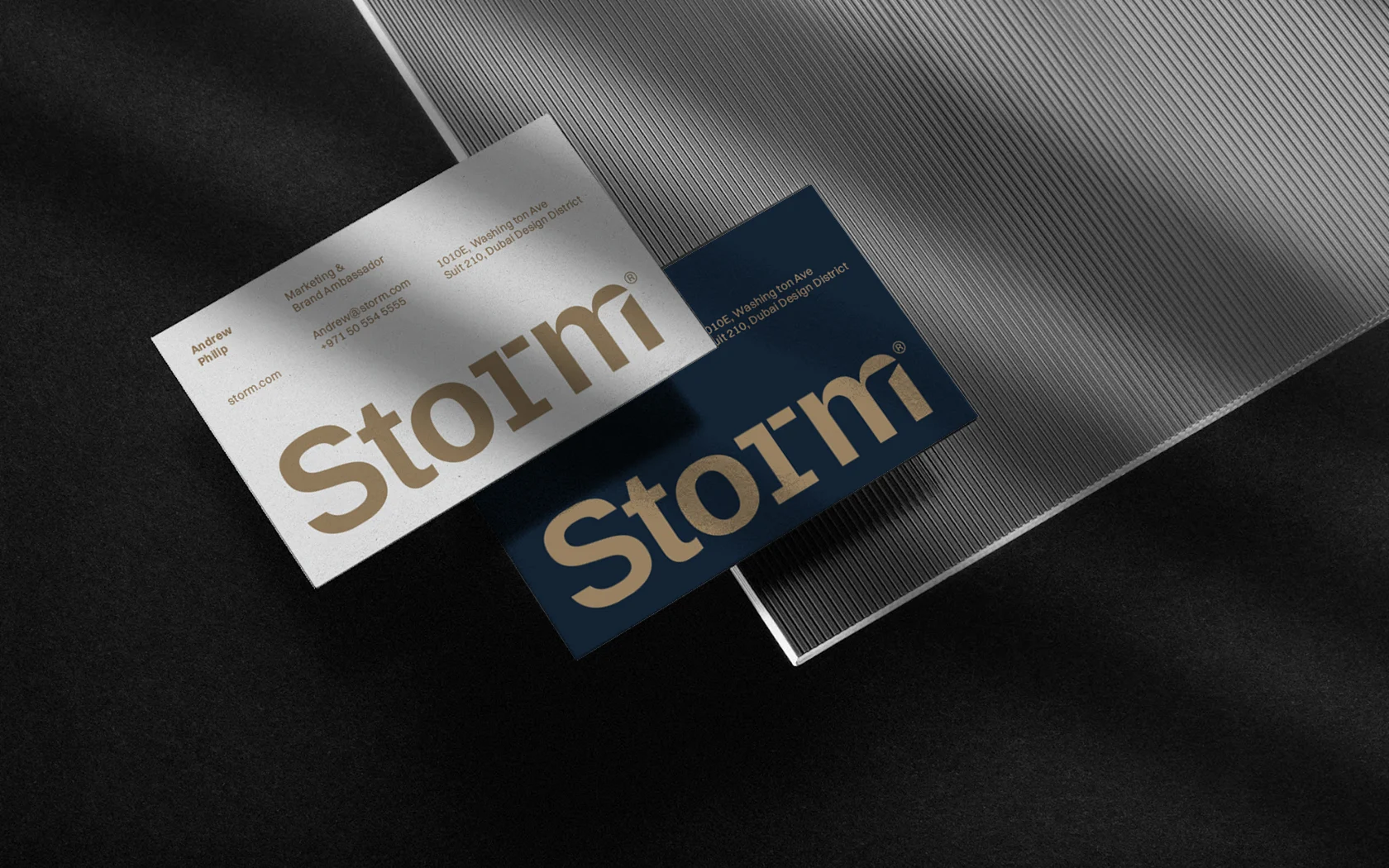
- Corporate Stationery

Real estate, refined
Storm Real Estate understood the market well — they were fast, responsive, and knowledgeable. But their brand didn’t reflect that. It lacked the visual edge that could establish instant credibility with buyers and investors. Our job was to design a system that stood out in a saturated market, while staying approachable and grounded in trust.

Designed to move people
We began with the logo — crafting a minimal yet meaningful mark that felt modern and versatile. Every detail carried purpose:
- -The S is subtly shaped to resemble the number 1, symbolizing Storm’s promise to be at the top of their game and deliver best-in-class service.
- – The M includes an arrow pointing forward, signifying progress and growth — essential traits in both real estate and life.
- – That same shape also resembles a doorway — representing the act of investing in a space, opening new chapters, and stepping into possibility.
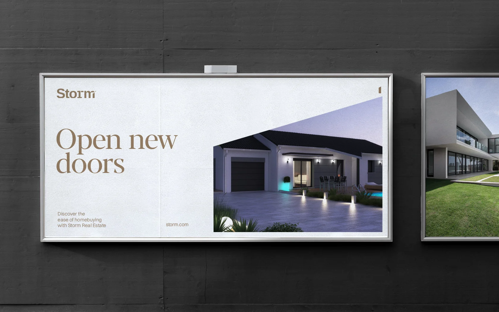
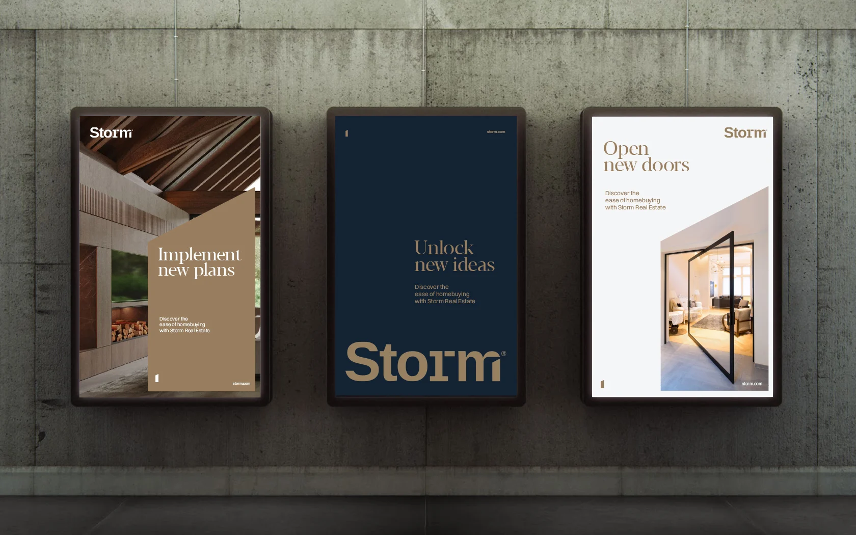
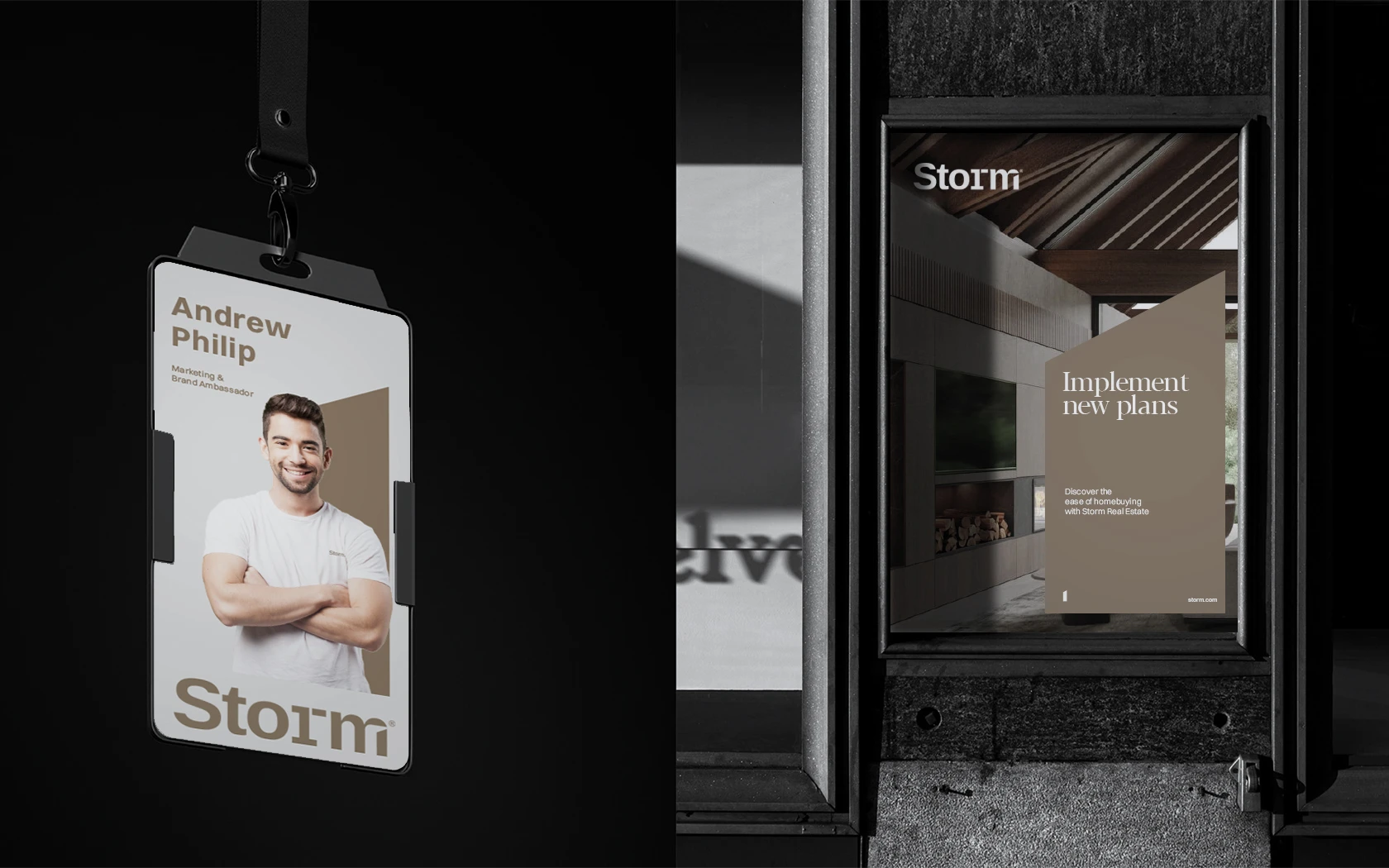
Combined with a bold color palette and sharp, professional typography, the identity was designed to evoke trust, ambition, and momentum. The corporate stationery extended this design language into daily interactions — ensuring consistency from first impression to final deal.
Our Impact
The result is a brand that feels as sharp as the service it represents.
The new identity has helped Storm stand out in a highly competitive market, earning trust from high-net-worth clients and everyday renters alike.
Today, Storm Real Estate doesn’t just guide transactions. It makes the journey feel effortless — and unmistakably premium.


