Eazy Life
One app. Every need. No friction.
Overview
In a world where everything is digital, convenience alone doesn’t cut it anymore. Today’s users want control, speed, and simplicity – all in one place. Eazy Life set out to do just that. Built as the region’s first true superapp, Eazy Life brings together everything from groceries to ride-hailing, payments to bookings – all within a single, seamless platform designed to make life, well, easier.
Services
- Brand Strategy
- Verbal Identity
- Logo & Visual Identity
- App UX Consultation
- Brand Guidelines
- Go-to-Market Content Strategy
Rebranding the super app experience
Eazy Life was built on solid tech. The backend was agile, the interface functional. But in a market flooded with lookalike superapps, functionality alone wasn’t going to win hearts. What it needed was a brand that could shift perception — from “just another utility app” to “an essential everyday companion.” Our mission was to make the experience feel effortless, while visually and verbally separating Eazy Life from the crowd.
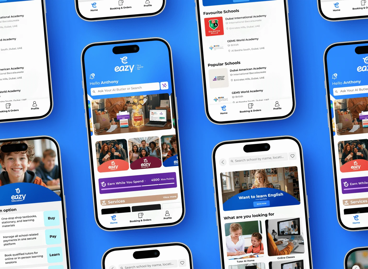
Simple by design, powerful by nature
We took a deep dive into user journeys, explored market gaps, and worked closely with the founding team to uncover what set Eazy Life apart. At its core was a promise of frictionless living – not through flashy features, but through fluid experiences.
Every brand touchpoint was reimagined:
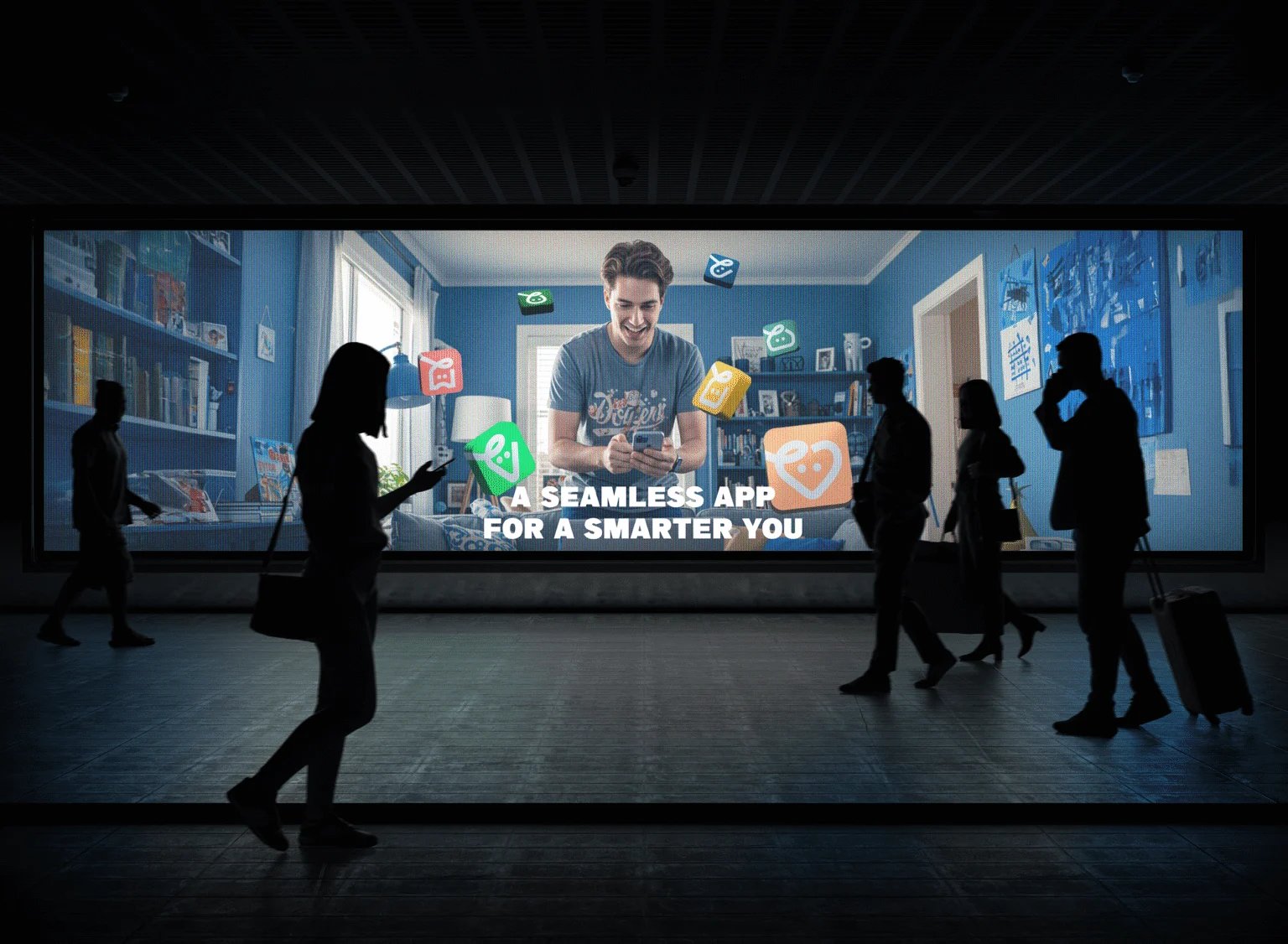
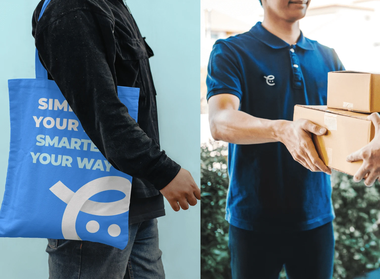
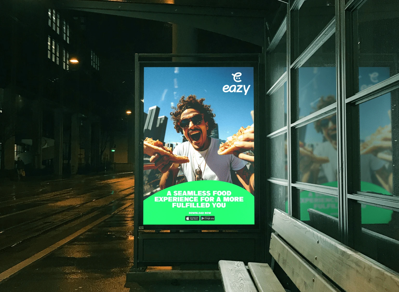
- – A sharp, modern logomark that reflects simplicity in motion.
- – A calming, confident colour palette that stands out in a sea of tech neon.
- – A tone of voice that speaks like a friend, not a platform.
The app’s UX was also refined – fewer taps, smoother flows, and copy that actually helps users get things done. We didn’t just build a brand. We shaped a lifestyle.
Our Impact
With a new positioning in the market and a new identity in place, Eazy Life now lives up to its name – delivering simplicity, speed, and satisfaction with every tap. The rebrand helped position Eazy Life as a serious contender in the region’s crowded digital landscape, driving user adoption and investor interest.
More than a platform, it’s now a habit – one that’s quietly transforming the way users live, work, move, and manage their days. All through one app.
And that’s the power of getting the brand right.
More than a platform, it’s now a habit – one that’s quietly transforming the way users live, work, move, and manage their days. All through one app.
And that’s the power of getting the brand right.